Capital One · Mobile App
Monitor your money on the go
In 2015 Capital One released a brand new mobile app to help customers manage their account. Today the app is used by nearly 1 million customers to view transactions, make payments, and manage their account.
This case study is broadly broken down into smaller challenges and what my role and input was to overcome the challenges and progress forward.
PRODUCT GOALS
Create a mobile app to allow customers to easily service their accounts, receive relevant information regarding account health and increase overall engagement with Capital One.
RESULTS ACHIEVED
- Shipped both an iOS and Android app within 6 months, earlier than anticipated.
- Evangelised and implemented a a human centred design culture.
- Influenced the product roadmap to cater for user needs rather than business oriented requirements.
SKILLS DISPLAYED
Product concept, product roadmap, user process diagram, accessibility, usability, interaction design, visual design, icon design
Execute an information re-architecture of the existing apps
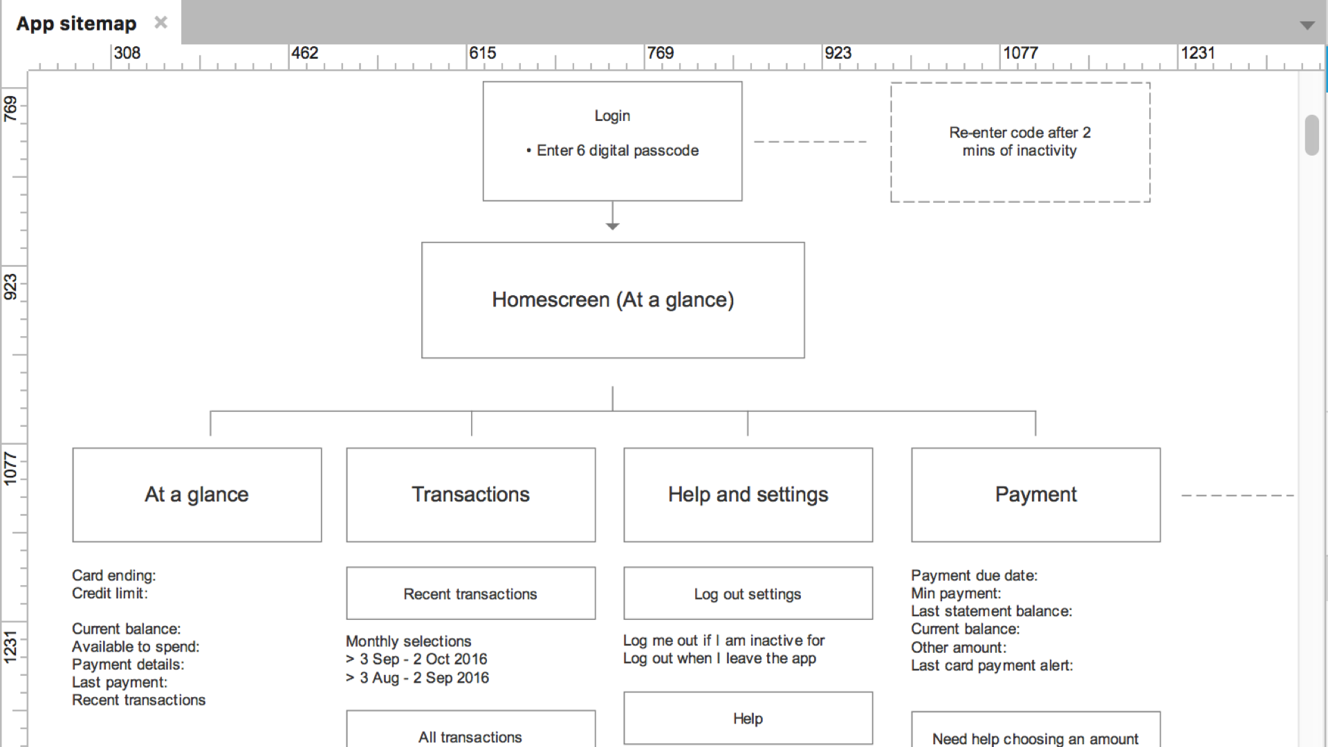
The existing app allowed customers to view their previous transactions, account balance and next payment date, but fundamentally failed to help customers make a payment and navigate the app in a meaningful way.
Our goal was to allow customers to make a payment via the app as well as update the Information architecture (IA) to help customers easily see and browse to the content that they need.
ACTIONS I TOOK
- Implemented a process to be able to conduct user interviews in-house.
- Gathered user needs and use cases first hand.
- Analysed existing IA's from direct competitors.
- Created multiple options of potential IA's, reviewed with internal stakeholders and customers, further iterated and refined with engineers and product owner.
THE OUTCOMES
- A diagram of the existing IA of the application, suitable to be expanded to meet future features and requirements.
Create an experience which respects platform norms and conventions
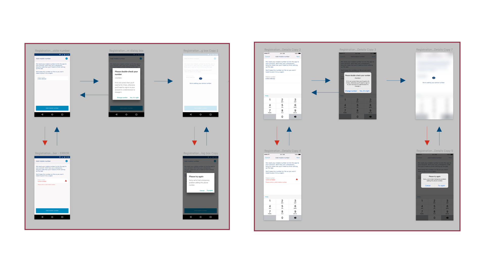
Roughly one third of customers had an Android device, however initial appetite from the business to create a native Android application was low. It was thought this would slow down development, and add additional unnecessary risk and complexity.
My partners in Engineering were becoming increasingly demotivated by the notion of a hybrid app, with heavy usage of non-native elements for the Android platform.
Essentially, Product was happy to progress with a subpar solution for Android, however Engineering wasn't bought in to the idea.
ACTIONS I TOOK
- Conducted user interviews to hear first-hand what customers thoughts and expectations included.
- Studied and became a subject matter expert of Material Design by Google and how through its adoption we'd be able to create a consistent experience, even across platforms.
- Gathered and analysed customer device usage statistics to get buy in and reassure Product counterparts with regards to my design decisions.
THE OUTCOMES
- Became the first financial services app on the Google Play store to launch with Material Design principles.
I summarised my learnings and gave a presentation at Mobile Notts, a meetup of mobile developers and designers in Nottingham. It was shortly after Google had announced Material Design and the community wasn't sure how to adopt and integrate it into their applications.
Apply an appropriate brand style for the app
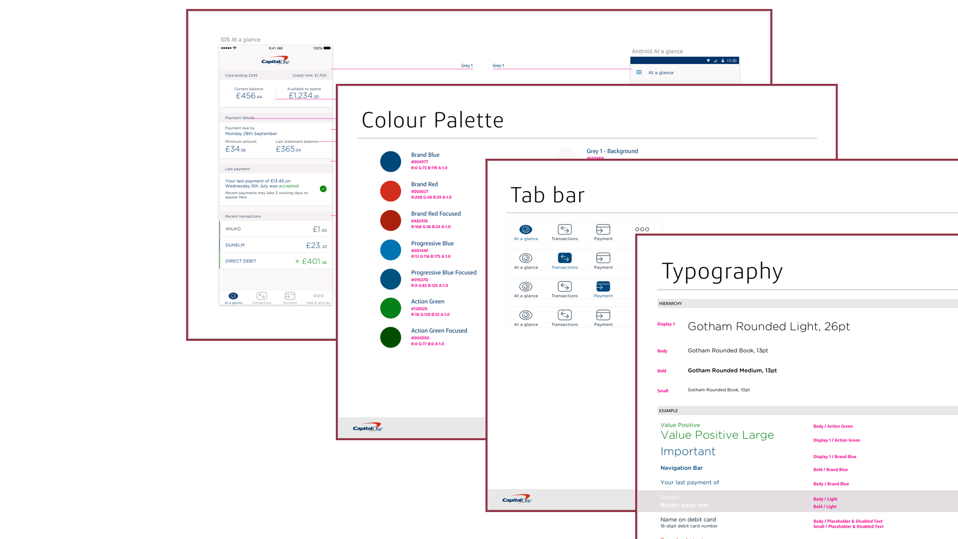
The existing Capital One brand guidelines and assets were created and optimised to work for print and the web, but not for mobile applications.
The challenge was to modernise the existing standards, suggest improvements, and execute on these recommendations.
ACTIONS I TOOK
- Worked with the existing brand colour palette to find appropriate uses of colours throughout the apps.
- Collected and studied multiple font options, considering how this could also work with feature icons, line icons, and imagery.
- Collaborate with the existing Brand team to ensure buy in and build a long term relationship.
Improve the accessibility of the app
The app was put forward for accessibility review as part of the usual Capital One quality process and had come back non-compliant, particularly with regards to colour contrast. Product counterparts were also reluctant to make any large noticeable changes to the UI with fears of causing customer confusion and uncertainty.
The challenge was to modernise the existing standards, suggest improvements, and execute on these recommendations.
ACTIONS I TOOK
- Deconstructed the colours and their usage criteria within the app, looking for similar hues from the enterprise colour scheme.
- Once appropriate replacement shades were found, I compared the foreground and background colours to make sure they passed at least a WCAG 2 AA rating.
- Implemented the new colours closely with partners in Engineering and Quality Assurance to quickly address the non-compliant colour accessibility issue, whilst minimising UI change.
THE OUTCOME
- The app is now compliant with WGAC 2 AA rating.
- A rooted attitude within the product development team that a user with accessibility tools enabaled shouldn't be treated as a second class citizen.

My Design Process
- Understand the initial purpose of the feature
- Review existing solutions from both direct and non-direct competitors
- Create a vision piece to act as a stake in the ground, and gold standard solution
- Distribute a user process diagram, to be shared with wider business stakeholders and gauge any concerns or recommendations
- Regularly review concepts with users to gain insights and make any required adjustments
- Work closely with partners within Product and Engineering to ensure buy-in and alignment from day 1
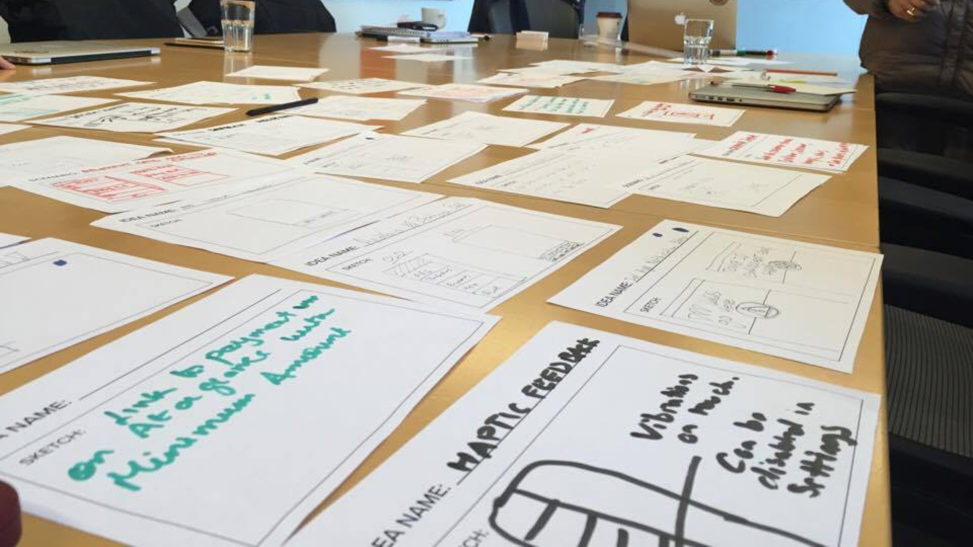
Host ideation sessions with the development team
METHODS USED
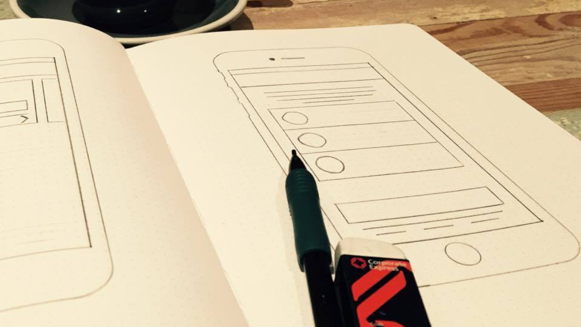
- Storyboarding
- Crazy 8's
- Mindmapping
- Role playing
- "Yes and"
- Information Architecture mapping
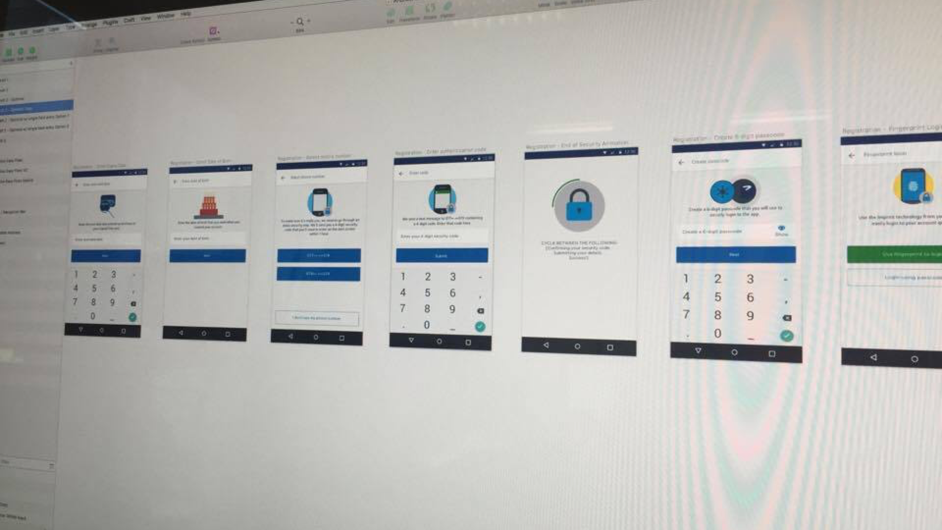
Use multiple techniques to create high-fidelity mockups
METHODS USED
- Produce redline & spec documents
- Create interactive prototypes
Community
In early 2014, Capital One found itself in a place of change. Waterfall was quickly becoming dated, and Agile adoption was growing rapidly. The mobile app was said to be the flagship product showcasing the new, quicker, leaner, more agile way of working.
Capital One was relatively unknown, particularly amongst the technology sector. The challenge was to be able to grow the reputation.
ACTIONS I TOOK
- Worked the HR and Engineering to form a group of advocates, and create a process allowing Engineers to easily speak at events and conferences.
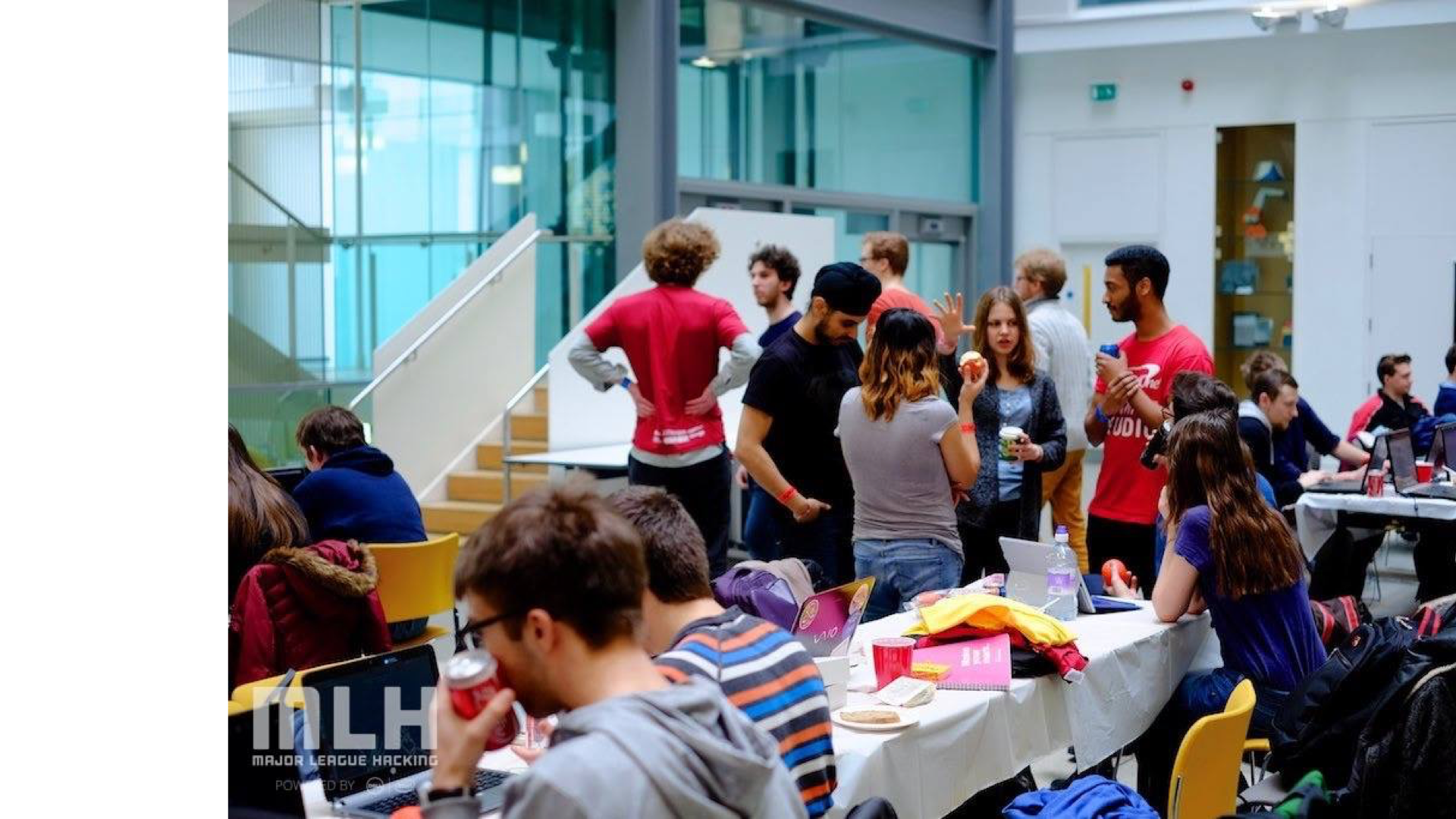
- Influenced key stakeholders in Engineering to use a portion of their budget to sponsor and attend student hackathons, suggesting this would help grow the graduate pipeline years down the line (I was right.)
THE OUTCOMES
- Attended multiple student hackathons, part of the Major League Hacking circuit representing Capital One.
- Influenced the strategy Capital One took with regards to attending events.
Android Summit 2015
This was presentation I was invited to share at Android Summit in McLean, VA, USA discussing the journey we took to help raise Android as a first class citizen within Capital One.